A Complete Guide to Strip Charts: What They Are and Why They Still Matter
If you work with real-time data, chances are you have run into a strip chart at some point. Engineers, lab technicians, plant operators, and even traders rely on them every day to keep an eye on things that change second by second. This blog covers the full story: where they came from, how they work now, and why they refuse to disappear in 2025.
Note: When you open charts over the internet, never skip the VPN step. iProVPN is one of the options teams use to keep everything encrypted end-to-end.
What Is a Strip Chart?
Picture a long roll of paper slowly moving under a pen that goes up and down as it measures something (temperature, pressure, voltage, whatever). That moving paper with the wiggly line on it is the original strip chart. Today, most of them live inside computer screens instead of on paper, but the idea stays the same: new data keeps arriving on the right side of the screen while older data scrolls left and eventually drops off.
You get one steady, unbroken line that shows exactly what has been happening over the last few minutes, hours, or days. No gaps, no separate pages, just a constant flow.
Where It All Started
The first working strip chart recorders showed up in factories around the 1920s. Companies like Leeds & Northrup and Foxboro built machines with clockwork motors that pulled paper at a steady speed while a pen linked to a sensor drew the trace. By the 1950s, every chemical plant and power station had walls full of these machines clicking and whirring away. Operators could spot a drifting temperature or a sticky valve just by glancing at the moving line.
Paper lasted a long time because regulators loved the permanent, ink-on-paper proof that nothing had been changed after the fact.
Computers started taking over in the 1980s. First, they just stored the numbers, then they began drawing the same style of scrolling trace on screen. Once flat-panel displays got cheap and fast enough, the paper rolls finally started gathering dust.
How the Digital Version Works Today
New numbers come in from sensors or network streams. The software keeps the last few thousand (or million) points in memory and draws them as one continuous line. When fresh data arrives, everything shifts left by one pixel, and the newest point appears on the right edge. Do that fifty times a second, and the line looks alive.
Most programs let you pick how many seconds or minutes fit across the screen, exactly like turning the time-base knob on an oscilloscope. Change it from 1 second per division to 1 hour per division, and you instantly switch between watching tiny ripples or spotting trends that last all day.
Why People Still Love Them
A strip chart gives you answers the moment you look at it. A spike jumps out at you. A slow drift is impossible to miss. You do not need to click around or wait for a report; the story sits right there on the screen.
They pack huge amounts of history into a small space. One narrow window can show an entire eight-hour shift without feeling crowded.
When something goes wrong, the recording from that exact minute becomes evidence. Many industries still keep these files for years.
If you ever need to check a remote plant or a test rig from home or while traveling, a good VPN matters. iProVPN lets engineers open those live charts securely without exposing the control network to the open internet.
Where You Will Find Them in Real Life
Chemical reactors watch half a dozen temperatures and pressures at once. Hospital bedside monitors draw heart rhythms and oxygen levels. Power-station control rooms tracking generator frequency and turbine vibration. Environmental stations log air quality hour after hour. Even some trading desks plot tiny price movements the same way.
Anywhere something has to be watched continuously, a strip chart is usually somewhere in the background.
Build One Yourself in Python (It Takes Ten Minutes)
Want to see how simple it is? Copy this code and run it. You will get a live scrolling trace of random numbers that behave like a noisy sensor:
Python
import pyqtgraph as pg
from PyQt5 import QtWidgets
import numpy as np
import time
from collections import deque
class LiveChart(pg.GraphicsLayoutWidget):
def __init__(self, points=1000):
super().__init__()
self.plot = self.addPlot()
self.line = self.plot.plot(pen=‘y’)
self.buffer = deque(maxlen=points)
self.timer = pg.QtCore.QTimer()
self.timer.timeout.connect(self.refresh)
self.timer.start(50)
def refresh(self):
value = np.sin(time.time() * 2) * 50 + 50 + np.random.normal(0, 5)
self.buffer.append(value)
self.line.setData(np.array(self.buffer))
app = QtWidgets.QApplication([])
window = LiveChart()
window.show()
app.exec_()
Replace the fake data line with your own serial port or network feed, and you have a real monitoring tool.
What the Best Modern Tools Can Do
Today’s charting packages go way beyond a single moving line. You can zoom back through weeks of archived data without slowing down, overlay yesterday’s trace for comparison, set smart alarms that learn normal behavior, and view the exact same live picture on your phone in the parking lot.
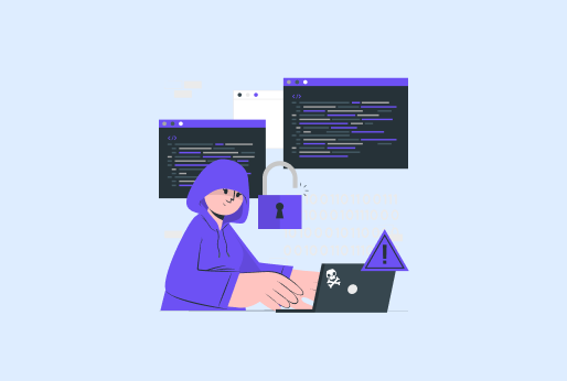
Remote access has become normal, but so have attacks on industrial networks. That is why many companies require a solid VPN tunnel before anyone can open a live chart from outside the site. iProVPN handles the speed and encryption side without adding noticeable lag, which matters when you are watching high-speed streams.
Picking the Right Tool for the Job
Small projects can run on a Raspberry Pi with free software. Medium plants usually buy dedicated loggers from Yokogawa, Eurotherm, or Honeywell. Big sites roll out full historian systems like OSIsoft PI or Ignition that include rock-solid strip charting as one small part of the package.
Think about update speed, how many signals you need, how long you must keep the data, and who needs to see it from where.
Tips From People Who Use Them Every Day
- Set the time scale so normal changes fill about half the screen height. Too compressed and problems hide; too stretched and you miss the big picture.
- Pick colors that stay readable when someone prints the screen in grayscale for a report.
- Add a thin band around the normal operating range; anything outside it turns red instantly.
- Calibrate sensors before you trust the trace.
FAQs
A trend graph usually shows a fixed time window that you zoom or scroll manually. A strip chart keeps scrolling live data all the time; new points push old ones off the left side automatically.
Digital versions easily handle thousands of updates per second on normal computers. Old paper recorders topped out around five or ten traces per second.
A few nuclear and pharma sites do because regulators demand ink-on-paper records that cannot be edited later. Everyone else went digital years ago.
One channel at one sample per second takes roughly 3-4 MB per month. A hundred channels at 100 Hz can fill terabytes in a year, so good compression and smart archiving are essential.
Many systems use their own fast binary formats day-to-day, then export to HDF5, TDMS, or even plain CSV when someone needs to open the file in Excel.
Yes. Libraries like Highcharts Stock, Plotly, or Smoothie Charts give smooth scrolling performance even on phones, as long as the data arrives over WebSockets.
What sets a strip chart apart from a regular trend graph?
Can they keep up with really fast signals?
Does anyone still use actual paper in 2025?
How much storage do they need?
What file formats do people export to?
Can you run a decent strip chart in a web browser?
Final Words!
Strip charts have been around for a hundred years because they solve one job perfectly: letting a human see at a glance what is happening right now and what just happened. Screens got better, networks got faster, and security got tighter, but the basic moving line is still the clearest way to watch a process that never sleeps.
Next time you are staring at a wiggly trace trying to figure out why the pressure jumped at 3:17 a.m., remember you are looking at a tool that has not changed much since the 1930s. It just moved from a roll of paper to pixels, and it still works.
iProVPN encrypts your data for protection against hackers and surveillance. Unblock your favorite streaming platforms instantly with the best VPN for streaming.
Start Browsing Privately!